Monday, April 28, 2014
Tuesday, April 22, 2014
PROJECT 12-Participation
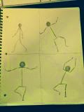
The stick figures could be better drawn. The limbs do not connect most of the time. When they do, they lack the depth shown in class. Otherwise, the storyboard is clear and the rest of the drawling makes sense. http://mbfishman-gdd110.blogspot.com
My Storyboard:
In order to improve my storyboard, I could make the sizes of the sticks figures more relative in each panel. Sometimes the size of one of the figures changes from tall to short. Otherwise, I could work on shading the walls and flooring more so and focus on giving a little more detail. Besides that, may be some of the limbs could be better drawn and more clear.
PROJECT 11-Deliverable
The synopsis of my stick figure game, The Line, involves the main character,
Lineardo, chasing down a secret terrorist agency, WATER, plotting to destroy
all the erasers of the world. Lineardo is tasked with stopping these terrorists
from achieving their goal and eraser all of stick-figure-kind. He is the only
one with the skills to save their world. He must use his fists, legs, and
findable weapons to dart through the terrorist fortress and defeat their
leaders in order to stop them from getting the erasers. This game is a 2D Platformer,
such as that of the original Donkey Kong.
Powers:
- · Trained in the fighting arts
- · Skilled in firearms
- · Skilled in blades
Weaknesses:
- · Leg is scarred from past mission
- · Weak in one verse one combat
- · More brawn than brains
Tuesday, April 15, 2014
PROJECT 11-Participation
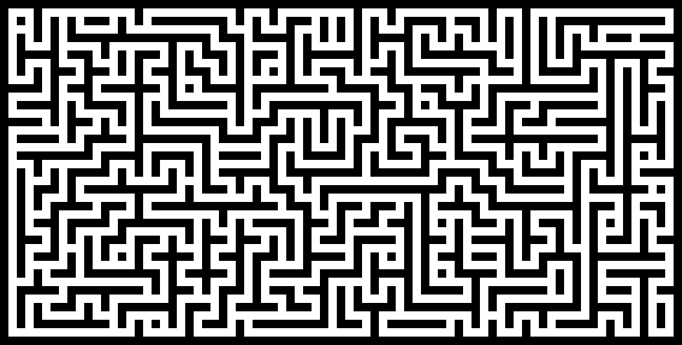
The textures look a little distorted, but that is probably just from the render quality. This makes the textures a little unrealistic, but, as stated, probably not your fault. The overall lighting is good, some area's are a little dim but the lighting is difficult so you did a good job of it. The bump map fits overall and the rendering does suggest a larger maze. - http://mbfishman-gdd110.blogspot.com/
I could fix the textures of the walls and make it look more realistic. Maybe moving the location of camera would make it look better. Some little tweaks could make the maze look better and more crisp.
I could fix the textures of the walls and make it look more realistic. Maybe moving the location of camera would make it look better. Some little tweaks could make the maze look better and more crisp.
Monday, April 14, 2014
Tuesday, April 8, 2014
PROJECT 10-Participation
The texture is a little distorted by being stretched. It looks a little fake and low quality because of it. The illusion of the wall is somewhat realistic. It looks nice, but again, it is a little stretched. The lighting could be improved by not letting it go behind the wall and focus more so on the wall. Otherwise, it is good. The bump map works good and goes with the image. http://mbfishman-gdd110.blogspot.com
Improvement:
I could improve my wall by trying to make it look not as squashed. I could possibility increase the size of the lighting to give a broader perspective. It may fit the wall face more. Otherwise, I believe the wall is pretty well done. I think it fits good in the scene.
Improvement:
I could improve my wall by trying to make it look not as squashed. I could possibility increase the size of the lighting to give a broader perspective. It may fit the wall face more. Otherwise, I believe the wall is pretty well done. I think it fits good in the scene.
Tuesday, April 1, 2014
PROJECT 9-Participation
The overall pixel image looks great. The bottom right wall/pool side is a
little messed up in color though so the shading and color palette may
need to be addressed. Also, some of the blocks look as if there is
spacing between them. I would just make sure that you look at blocks
that may not be placed on the same plane or connected. Make sure it is
executed correctly.
http://mbfishman-gdd110.blogspot.com
In order to improve my design, I could make things more symmetric and complimentary in size. I could try and make the image less blurry and make sure the diagonals are right. Otherwise, I just need to make sure it is completely isometric and in the right perspective.
Subscribe to:
Comments (Atom)


.JPG)


.JPG)


.jpg)


